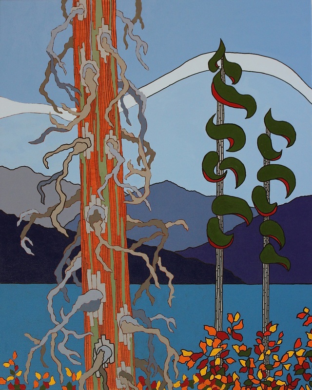
| In the past, when I've done a painting in acrylic and ink, I've usually started with a white canvas. A while ago, however, I decided to try painting the canvas a different colour before I started my process of drawing the picture, and then adding the finished colours. Most of the time, I will use a blue, or green/yellow for the underpainting. Note: (This is a different technique than what I do with my straight acrylic paintings.... with those I paint the entire canvas a mix of black/gesso/purple/blue... and then once that is dry, I draw my painting with chalk, and then paint it... leaving the lines showing around the colour.) The painting I'm working on now is acrylic and ink. I decided to try a "dulled" orange as my underpainting. My reasoning was that I was going to put a lot of blue in the painting, and I was going to use some oranges, rusts, and reds as well. I thought orange would be a good choice because it would complement the blue, and it would help the oranges "pop". For the most part, I think it is working but I find myself struggling with the orange as I am painting. What I mean is... it is not as easy to keep focused on what I want the big tree to look like.... i keep getting distracted by the fact that it is a huge orange tree still. So it is making me uncomfortable. Sometimes it is hard to look past what it looks like to see what you want it to look like. I guess I would find it easier to look past a blue, green, or even gray tree ..... the orange is just bugging me, but in a strangely, weirdly good way. :) The more I look at it, the more fascinated I am with it. Hey..... i guess I kind of sound like an artist. :) |
|
2 Comments
Adele
9/4/2014 12:33:31 pm
I love reading these posts Liz. Great job. As always I'm dying to see what the finished painting will be. Leave a Reply. |
AuthorLiz R. Derksen is an artist living in BC. 
Archives
May 2018
Categories |
 RSS Feed