Liz R. Derksen - Artist
  • Home
  • Recent Work
  • Blog
  • Contact
  • Archives
  • Shows and Events
  • Calendar and Prints

Finding Balance

6/25/2014

2 Comments

 
Picture
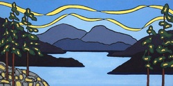
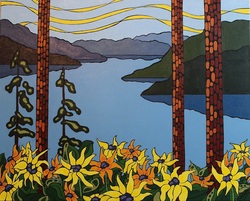
First an introduction to my most recent painting.... " Solstice ".  I used acrylic paint on a black gesso'd canvas.  This one is a little smaller than my usual at 12x24 and is also horizontal.

So re: balance..... I hopped on the scale this morning hoping for some kind of miracle and was disappointed.  It seems that I have put on some weight.  So, how do I find balance.  When I am painting, i get quite lost in it and I am sitting for several hours... taking breaks only to make lunch and have coffee.   It seems that burning creative energy does not equal burning calories.... what a disappointment that is.  I need to make some changes here.

My inspiration comes from being outdoors... hiking, walking etc..  I don't want to get to a place where I am physically unable to hike.  I also would love to get back into skiing this coming season.  So... I am going to make time for some activity each day.  I am going to schedule it in.  I will start with daily walks, with some hiking thrown in on the days I'm not painting.  I will start making some healthier food choices as well.  I WILL find this balance.  
2 Comments

Pthalo 

6/14/2014

2 Comments

 
Picture
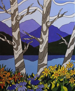
So... last week, I received an email from a wonderful artist and friend of mine... Gladys W.  She sends me emails of encouragement and has been a big influence to me in a positive way.  She suggested that I try as my blue, yellow, and red.... phthalo blue, hansa yellow, and quinacrinone crimson.  So I did... and here is the result.  This painting is called "Pthalo".  

Here is what I learned/discovered and am questioning....
I LOVE the greens I was able to mix.  I do notice a harmony in this painting as far as the colours go.  I was able to "grey down" the back ground areas in a more pleasant way.  I love the crimson... it made a beautiful purple with the blue, and was a more true red colour than alizarin or cadmium red.  It also made a lovely bright orange.  I did struggle a bit with the yellow.  A lot of artists use hansa yellow but I've never taken to it.  I prefer cadmium yellow as it seems more opaque than hansa which I like since I sometimes paint on a black canvas.  Is there a reason why hansa is preferred?  If anyone knows.... let me know, ,maybe it is just personal preference.  

Anyways.... I'm very happy with this painting :)   On Monday I'm heading down to Penticton with it and 3 other new paintings to have photographed.  I'm sure I will be inspired by my drive down as I always am.  We live in a beautiful country.

2 Comments

Sketching

6/10/2014

1 Comment

 
Picture
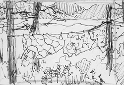
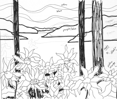
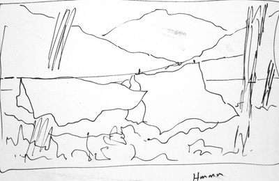
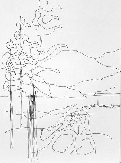
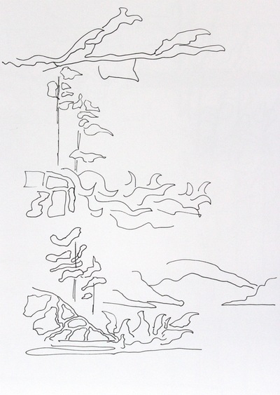
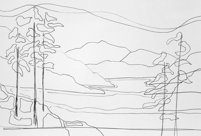
Yesterday, I sat down to paint.  I spent some time thinking about different colours, and how to mix them, and focal points etc...  Then I started to sketch because I was feeling somewhat overwhelmed.  I think sketching for me is like Yoga.  It is calming, peaceful and meditative.  It is like breathing out an idea.  I know it is said that for some people, petting a cat or a dog can reduce blood pressure.  I think this is true for me when I am sketching, or painting.  

As I look back at my sketches, I can see things about myself that are released onto paper.  I enjoy solitude.  I love the feel of the wind, and being outdoors.   Trees seem to be part of my soul..... and I obviously live in BC.  

Today I started a painting from one of these sketches.  I'm very happy with it, and now... lucky me..... I get to spend the next 4-5 dwelling in that painting.  

1 Comment

Ghosts

6/7/2014

0 Comments

 
Picture
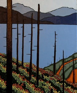
I just finished this painting today.  The inspiration for the painting came while I was driving south on the #5 between Little Fort and Kamloops.  If you drive along that highway you will see where the large Barriere fire went through a few years back.  What struck me was the beautiful lines of new growth marching down the mountainside almost in rows.  While this painting has beautiful bright colours trailing down the mountain, there is also a sense of sadness.  The trees have been silenced.  I decided to call it "Ghosts" because the trees are quiet, and still.... but present.

One of the things I tried to do as well, was to use only 3 colours and white.  I used alizarin crimson, hansa yellow, and anthraquinone blue.  I did stick to those 3 colours but was unable to mix a satisfactory orange, so I did use a cadmium orange mixed with my yellow for the bright orange.  I think next time I will use a different red.  

I love painting.  :)

0 Comments

The Meeting

6/1/2014

0 Comments

 
Picture
First, an introduction to my latest painting.  It is called "Mountain High".  To me this looks like a secluded mountain lake, peaceful and still.... just waiting for a gentle kayak, or canoe... or me :)

So... the FCA meeting.  What a GREAT experience.  I was so nervous going in to the meeting... mostly about the critique part of it.  A critique is when you present a piece of your work for feed back, both positive and not necessarily negative but rather ways to improve it.  I was so pleasantly surprised by the whole process.  I learned so much from both the critique of other's work as well as the critique of my own work.  It was positive, and extremely helpful.  I could understand exactly what they were saying, and could see how working on different areas, and changing a few things could make a huge difference.  

For example.... if you look at my previous blog post.  The picture I posted... "Fresh", was one of the paintings I took in for critique.  What they said was that the area where the lake is in the painting might work better if glimpses of the lake were seen through the bushes on the left side of the painting.  It would draw the eye away from being held in the centre of the painting.  I could see what they were saying, so I took it home and I made a few changes.  Have a look at the before and after:


Before
After
The other advice I was given was to experiment with mixing my own colours rather than using straight tube colours as much.  This means that instead of using purple from the tube, I should mix my own from the blues and reds I'm using in other areas of the painting for example.  So.... I'm challenging myself to do a couple paintings using only a red, a blue and a yellow and mixing to those to get every other colour I need.  Should be a good leaning experience.  In my most recent painting.. "Mountain High", I mixed most of the colours in the fore ground from the same yellow, blue and red.  I can see that there is more harmony in this painting.  

I am learning so much with each painting I do.  I wish learning at school at been this much fun :)
0 Comments

    Author

    Liz R. Derksen is an artist living in BC.  

    Picture

    Archives

    May 2018
    April 2017
    June 2016
    March 2016
    February 2016
    January 2016
    October 2015
    September 2015
    August 2015
    July 2015
    June 2015
    May 2015
    April 2015
    March 2015
    February 2015
    January 2015
    December 2014
    November 2014
    October 2014
    September 2014
    August 2014
    July 2014
    June 2014
    May 2014
    April 2014
    March 2014
    February 2014
    January 2014
    December 2013
    November 2013
    October 2013

    Categories

    All

    RSS Feed