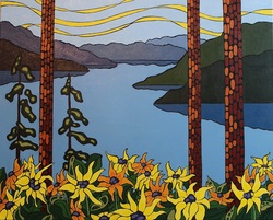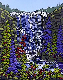
Here is what I learned/discovered and am questioning....
I LOVE the greens I was able to mix. I do notice a harmony in this painting as far as the colours go. I was able to "grey down" the back ground areas in a more pleasant way. I love the crimson... it made a beautiful purple with the blue, and was a more true red colour than alizarin or cadmium red. It also made a lovely bright orange. I did struggle a bit with the yellow. A lot of artists use hansa yellow but I've never taken to it. I prefer cadmium yellow as it seems more opaque than hansa which I like since I sometimes paint on a black canvas. Is there a reason why hansa is preferred? If anyone knows.... let me know, ,maybe it is just personal preference.
Anyways.... I'm very happy with this painting :) On Monday I'm heading down to Penticton with it and 3 other new paintings to have photographed. I'm sure I will be inspired by my drive down as I always am. We live in a beautiful country.

 RSS Feed