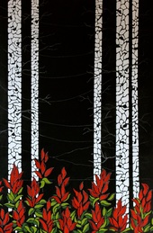
 I start with what is most in the foreground... in this case, it is the paintbrush flowers. Then, the birch trees. They were fun. I love creating shapes with paint and leaving the black underpainting showing through in areas to hint at branches, burls, rough bark and shadows. Then, I work on the sky. It is difficult for me to paint a plain blue sky. I LOVE the wind, the movement of the clouds and I think that comes through in most of my paintings. I have observed that the sky is lightest on the horizon and darker overhead and I enjoy painting the gradients of the colour of the sky in sections... each separated by a line of the black underpainting. 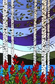 Finally, I erase the chalk lines, then add little bits of shape to fill in areas where I feel too much of the black is showing. I draw the trees down into the foliage with small white shapes, and the lake down as well with the same idea. Now, I sign it... and go over it once again, touching up areas that I feel need touching up. In a couple days, I will add a coat of varnish and I will be done. | For me, the first step to any painting is a good sketch. As I sketch, I pull out memories from my mind and they unravel in my sketchbook. Most of the time, I start with trees. I explore different types of bark, lines, shapes, foliage etc. Once in a while, I nail the sketch on the first try, but more often, I sketch until what I see on paper is what I am feeling/seeing inside. The next step for me is deciding what background colour I will paint my canvas. In this case I went with black. Once I paint the canvas black, I do a very rough drawing of my painting with chalk. When I say rough, I mean very rough... just an idea of where things should be. Then I start to paint. 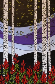 At some point here I decided to add leaves which were not in my original sketch... i like the effect. Then I painted the lake, and distant mountains. The blue I chose for this painting is Cobalt blue... one I do not normally use, but I was wanting to try something other than my usual Pthalo blue. The greens were mixed from Cad yellow, and Cobalt blue, the purple was straight Dioxazine purple and I needed some white and black to "grey" things down in some areas. The reds were a mix of Cad. red, and Quinacridone crimson. 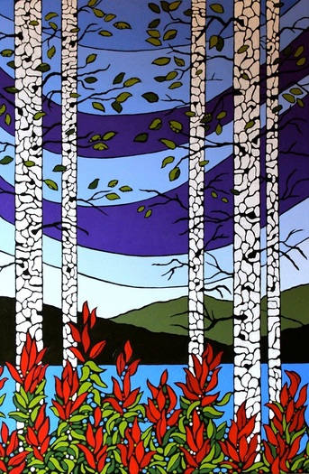 |
|
2 Comments
9/15/2022 05:34:07 am
hanks for sharing the article, and more importantly, your personal experience mindfully using our emotions as data about our inner state and knowing wsdchen it’s better to de-escalate by taking a time out are great tools. Appreciate you reading and sharing your story since I can certainly relate and I think others can to 9/15/2022 05:50:12 am
g the article, and more importantly, your personal experience mindfully using our emotions as data about our inner state and knowing wsdchen it’s better to de-escalate by taking a time out are great tools. Appreciate you reading and sharing your story since I can certainly relate and I think others can to Leave a Reply. |
AuthorLiz R. Derksen is an artist living in BC. 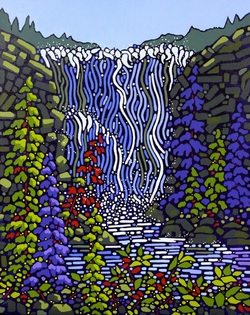
Archives
May 2018
Categories |
 RSS Feed